Introduction: The importance of colors in branding
Have you noticed how some brands transmit emotions and values even before their name is recognized? This is because the colors chosen for visual identity go beyond aesthetics: they influence emotional perception and audience behavior. Picking the right color is essential to create a connection, communicate clearly, and differentiate your brand in a competitive market.
The psychological meaning of colors
Each color evokes specific feelings in the brain. For example:
- Red: Stimulates energy, urgency, and passion. It can increase appetite or indicate immediate action.
- Blue: Associated with trust, security, and tranquility. Used in financial and tech sectors to convey credibility.
- Green: Related to nature, health, and growth. Ideal for brands aiming to express sustainability or well-being.
- Yellow: Evokes optimism and attracts attention, but its excess can tire the eyes.
- Black: Represents sophistication, authority, and elegance. Common in luxury brands.
Besides the base color, shades (lighter or darker) and saturation (intensity) alter these perceptions. A vibrant blue conveys youthfulness and innovation, while soft tones reinforce calmness and professionalism.
How to choose your brand colors
The color choice should align with your brand’s identity, values, and audience. A practical path includes:
- Define your brand profile: What are your core values? Innovation, tradition, sustainability?
- Know your audience: Age, culture, and expectations influence color connection.
- Analyze competitors: Observe the colors used in your sector to identify opportunities for differentiation.
- Prioritize coherence: Colors should reinforce your message, not contradict it.
- Consider flexibility: The palette must work across various media and supports.
Advanced color combination techniques
Selecting good colors individually is not enough; strategic combination is key. Essential techniques include:
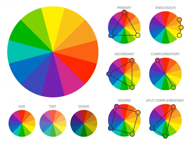
- Complementary harmony: Opposite colors on the color wheel, like blue and orange, create energetic contrast.
- Analogous harmony: Nearby colors, such as green, blue, and teal, create visual unity.
- Monochromatic tones: Variations of the same color for elegant, subdued compositions.
- Balanced contrast: Ensures readability and highlights key elements.
Applying these techniques in logos, digital, and print materials guarantees visual coherence and appeal.
Common mistakes and limitations in color selection
Brands often choose colors based on personal taste, lacking strategy, leading to:
- Disconnect with the audience: Color may not evoke the desired emotions.
- Poor visual harmony: Bad combinations hinder reading and damage professional image.
- Ignoring cultural context: Colors can have different meanings in various regions.
- Lack of practical testing: Colors that work on paper may fail on screens, prints, or under different lighting conditions.
Practical tests to validate your color palette
Before finalizing visual identity, test colors in different scenarios:
- View on multiple devices: Phones, computers, screens vary in color display.
- Print materials: Check color fidelity on paper.
- Simulate real contexts: Evaluate packaging, facades, promotional materials.
- Verify accessibility: Confirm contrast for legibility for all users.
These processes prevent rework and ensure brand effectiveness across environments.
Real-world examples and case studies
Brands like Coca-Cola use red to evoke passion and energy worldwide. IBM chose blue to reinforce technological trust. Natura favors green to highlight its commitment to sustainability. These examples demonstrate how color choices and combinations communicate and support the brand’s essence consistently and effectively.
Presenting the ideal solution for your brand
Understanding theory and applying techniques are essential but relying on tools that simplify decisions elevates your strategy. An integrated solution allows:
- Simulate palettes across multiple contexts and media.
- Receive personalized recommendations based on your brand profile and audience.
- Test harmonious combinations, avoiding common mistakes.
- Ensure visual coherence and expected emotional impact.
This approach simplifies the creative process and builds a memorable visual identity.
Conclusion and next steps
Colors are more than aesthetic details: they are a powerful language that transmits identity and values. Choosing and testing each tone carefully creates a strong, differentiated brand that genuinely connects with your audience.
To optimize this stage, try a free tool that helps in selecting, combining, and validating colors for your branding. With advanced support, you can craft a convincing visual identity aligned with your business.